What Effect Has Reversing Scales In A Grid Have On The Result?
Recently we tested the concern that the result of a scale question will vary depending on the direction in which you construct the scale.
The test was small but revealing.
Two independent, general population samples, each of 50 respondents, were matched on gender and age.
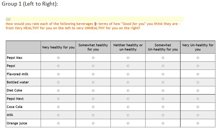
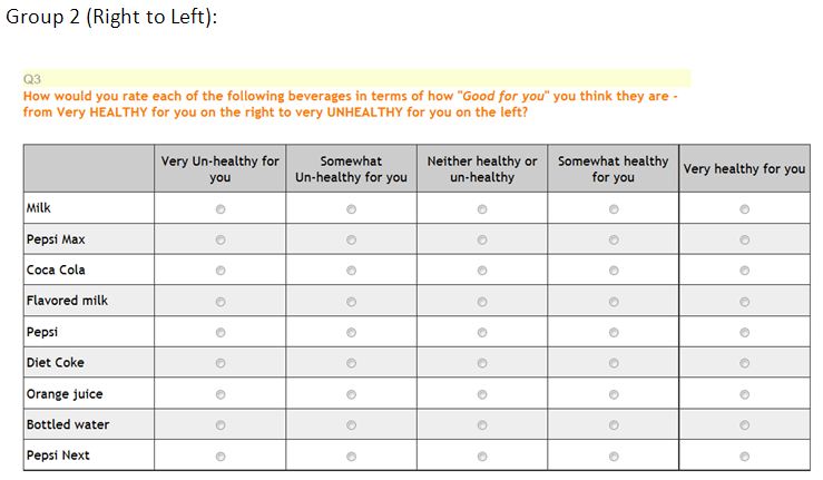
Each group was shown a grid of products (randomized order) and asked to rate them on “Healthy for you” – a five-point bipolar scale ranging from “Very healthy for you” to “Very Unhealthy for you”.
The only difference between the two groups was a reversal of the scale –
The Left to right group scale runs from “Very Healthy for you” to “Very Unhealthy for you”, and,
The Right to left group scale runs from “Very Unhealthy for you” to “Very Healthy for you”.
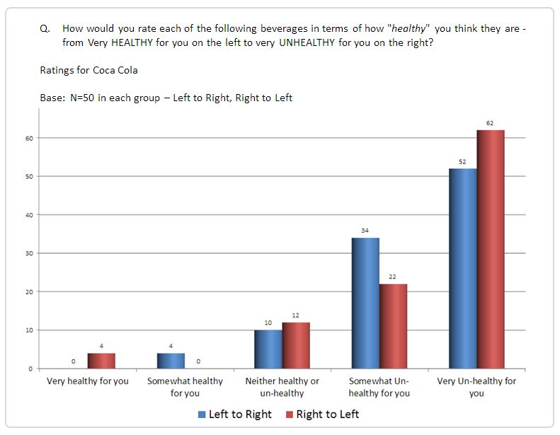
The chart below summarizes the result for the ratings of Coca Cola – the ‘Left to right’ group are in blue and the ‘Right to left’ group are in red.
We can see that the Right_to_Left group have an increased incidence of ‘Very Unhealthy for you”, compared to the Left_to_Right group.
It appears that respondents are more likely to select the end of the scale when it is on the left, rather than on the right.
Analysis across all products.
Table 1:
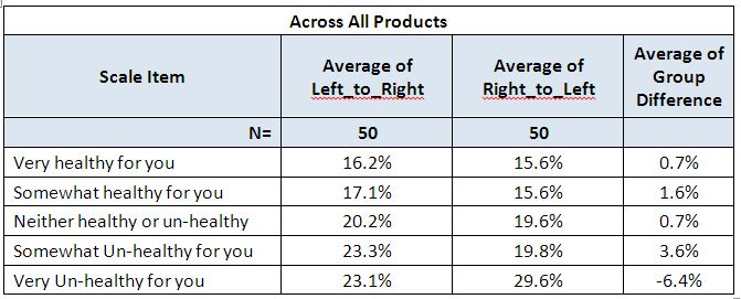
Across all products, we can see that the Right_to_Left group have an increased incidence of ‘Very Unhealthy for you”, compared to the Left_to_Right group.
It appears that respondents are more likely to select the end of the scale when it is on the left, rather than on the right.
A further analysis embellishes this proposition.
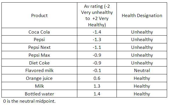
If we designate each of the nine products as being either Healthy or Unhealthy (based on their average rating of -2 for’ Very Unhealthy for you’, through to +2 for ‘Very Healthy for you’) we find the following:
Table 2:
Averaged over the two groups, only three products averaged on the healthy side of the scale. (bottled water, milk and orange juice).
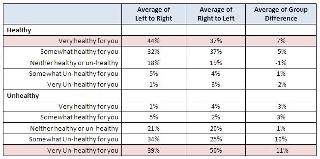
If we split the analysis by this health designation we find:
Table 4:
For Healthy products, ‘Very healthy’ scores best in the left_to_right group where it appears on the left.
For unhealthy products, ‘Very Unhealthy’ scores best in the right_to_left group, where it appears on the left.
This suggests that some respondents, (in reading from left to right), tend to click on the first item that matches their overall position (Healthy versus Unhealthy), regardless of whether it is ‘Very’ or ‘Somewhat’.
One clear implication of these results is that it is important to control for order effects. For instance, many researchers place great emphasis on DWB (Definitely Would Buy) in Purchase Intent Scales. The DWB percentage would be a prime candidate for the bias identified in the data above.
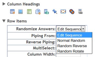
The simplest way to control for order effects of this nature is to randomly reverse the scale across the sample.
SMP allows this as an option on all grids with a feature called “Random Rotate“. Select if from the list of randomization options found in question parameters “Randomize Answers:” dropdown shown below.

